infographics
Data Visualization - Do's & Don'ts
The guide emphasizes the importance of creating clear and accurate data visualizations that effectively convey the intended message to the audience. It outlines best practices such as using appropriate chart types, ensuring accurate data representation, and maintaining consistency in color palettes and labeling. The document also advises against common pitfalls, including overwhelming the audience with excessive information, using too many colors or fonts, and neglecting to test visualizations with different audience segments. By following these guidelines, you can create visualizations that not only inform but also engage your audience, guiding them to key insights in a clear and accessible manner.
In addition to practical tips, the guide highlights the significance of tailoring visualizations to the audience's knowledge level and ensuring accessibility for all users, including those with color blindness. It stresses the importance of storytelling in data visualization, where each visual should lead the viewer to understand the main insights effectively. By adhering to these dos and avoiding the don'ts, you can refine your data storytelling and ensure that your visualizations resonate with and meet the needs of your audience.
What our Students Say
Your Author
EDNA Team
Data & AI
Frequently Asked
Questions
What’s the difference between a free account and a paid plan?
Do I need to know anything about data science or data analytics to get started with Enterprise DNA?
How will I be charged?
Can I get an invoice for my company?
Are refunds available?
Will AI take over the world and make data skills worthless?
Get full access to unparalleled
training & skill-building resources
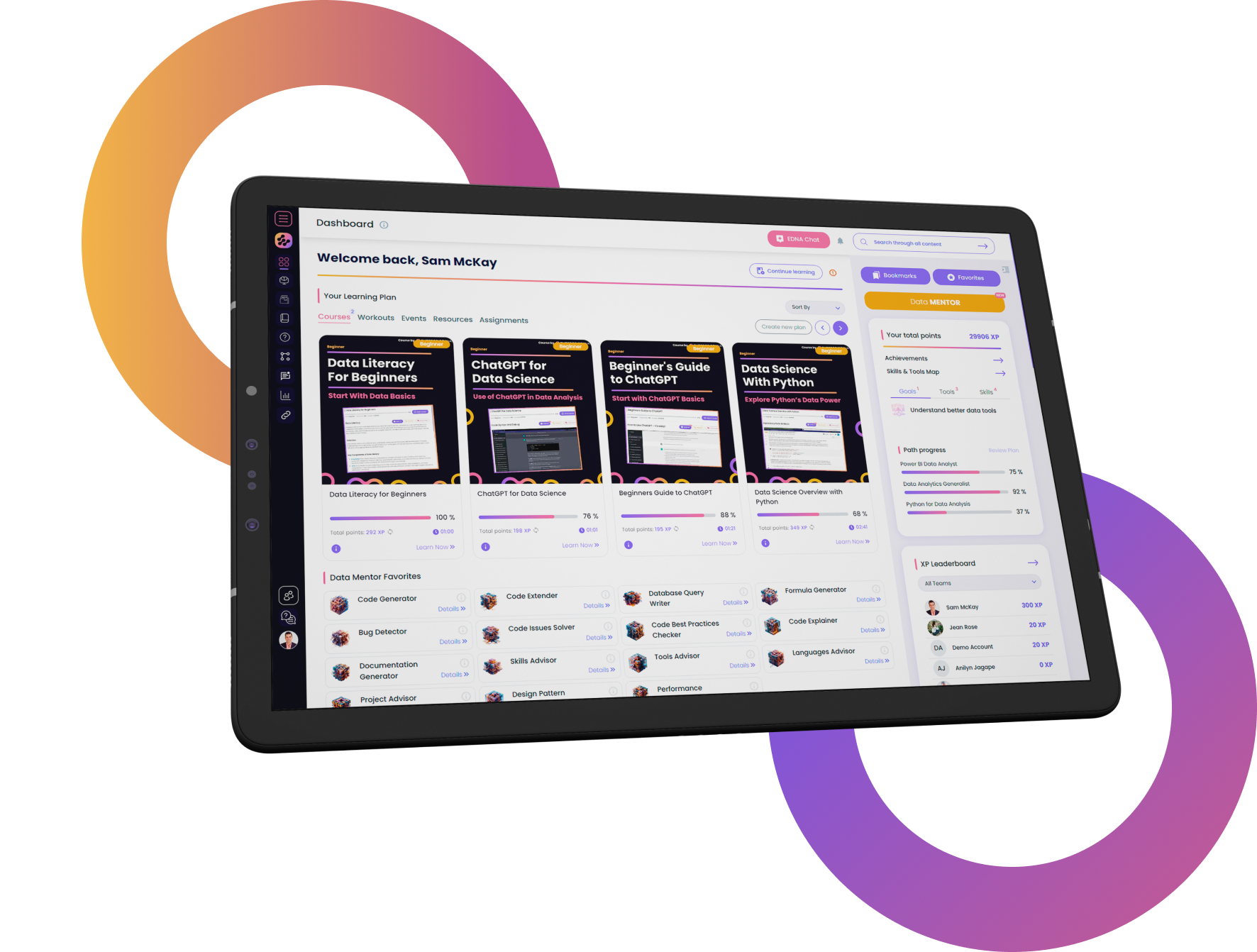
FOR INDIVIDUALS
Enterprise DNA
For Individuals
Empowering the most valuable data analysts to expand their analytical thinking and insight generation possibilities.
Learn MoreFOR BUSINESS
Enterprise DNA
For Business
Training, tools, and guidance to unify and upskill the data analysts in your workplace.
Learn More
Latest Guides
Loading


